
Knowing that passengers are using another airport is only the first step in understanding passenger leakage. Airport Air Service Development teams also need to know which competing airports are capturing those passengers, how much demand each competitor captures, and how the competitive pattern changes across the market.
The answer is not always the nearest or largest airport. An airport may have several important competitors, and their influence can vary significantly by geography, destination, and type of travel.
A competitor-airport analysis helps answer:
- Which airports capture the most passengers from our market?
- How many passengers are using each competing airport?
- Where do passengers using each competitor live?
- Which competitors are gaining or losing share?
- Does the primary competing airport change by destination?
- Are distant airports capturing particular types of trips?
The objective is to build a competitive airport profile of the local passenger market.
Rank Competing Airports by Passenger Volume
A useful starting point is to rank the airports used by residents within the target airport’s market.
For example, below are 2025 market shares of airports serving residents living within 2-hour drive to Cincinnati/Northern Kentucky International Airport (CVG) airport:
| Airport Used | Resident Passenger Trips | Share of Market |
|---|---|---|
| Cincinnati (CVG) | 5,222,390 | 48.6% |
| Louisville (SDF) | 1,790,655 | 16.7% |
| Indianapolis (IND) | 1,611,585 | 15.0% |
| Lexington (LEX) | 825,438 | 7.7% |
| Dayton (DAY) | 633,746 | 5.9% |
| Columbus (CMH) | 501,615 | 4.7% |
| Other Airports | 150,902 | 1.4% |
| Total | 10,736,332 | 100% |
This immediately shows that Louisville (SDF) is the largest alternative airport, but Indianapolis (IND) also captures a meaningful portion of the market.
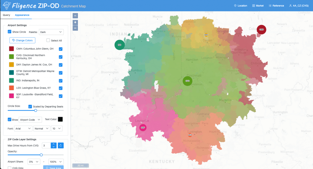
An airport competing primarily against one dominant alternative faces a different competitive environment from an airport whose passengers are distributed among several surrounding airports. For example, Colorado Springs (COS) competes heavily with one airport – Denver (DEN). In contrast, Trenton (TTN) competes for passengers with several major airports, including Philadelphia (PHL), Newark (EWR), LaGuardia (LGA), and J. F. Kennedy (JFK).
Identify Where Each Competitor Draws Passengers
Airport-wide totals do not show the full competitive picture. The next step is to map passengers according to where they live and which airport they use. One competing airport may draw heavily from communities north of the target airport, while another dominates communities to the south.
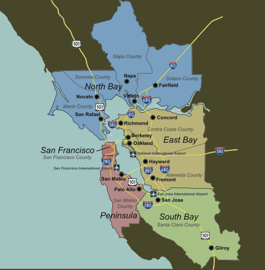
For example, table 2 shows market share of three primary airports serving the San Francisco bay area in 2025.
| Area | Target Airport (OAK) | Competitor A (SFO) | Competitor B (SJC) |
| North + Easy Bay | 36% | 60% | 4% |
| Penninsula | 2% | 97% | 1% |
| South | 2% | 36% | 63% |
For Oakland San Francisco Bay Airport (OAK), an airport-wide summary suggests San Francisco International Airport (SFO) is the largest competitor overall. But in the southern portion of the market, San Jose Mineta International Airport (SJC) is actually much more important. This is why identifying competitors should be both quantitative and geographic.
Multiple Major Competitors
Hagerstown Regional Airport (HGR) provides a good example of a market where passengers distribute themselves among several major airports.
A 2023 catchment study estimated approximately 902,938 domestic airline trips within HGR’s 44-ZIP-code immediate catchment.
The largest airports used by those travelers were:
- Baltimore/Washington International (BWI): 44.3%
- Washington Dulles International (IAD): 29.3%
- Reagan National Airport (DCA): 17.8%
The important insight is not simply that Hagerstown passengers use another airport. They use three different Washington-Baltimore airports in substantial numbers. For HGR, a competitive analysis that looked only at BWI would therefore miss almost half of the passenger demand flowing through the three major airports. The example demonstrates why airports should identify the complete competitive set using passenger behavior rather than selecting one nearby airport in advance.
The Primary Competitor Can Change by Destination
An airport’s competitive set can look very different when the analysis moves from total passenger demand to an individual destination.
Suppose the overall market looks like:
- Competitor A: 30%
- Competitor B: 20%
- Competitor C: 10%
But for passengers traveling to Los Angeles:
- Competitor A: 15%
- Competitor B: 50%
- Competitor C: 12%
Competitor B suddenly becomes much more important. Why? It may offer nonstop Los Angeles service, greater frequency, better schedules, or a stronger airline network for that particular destination.
This is why Air Service Development teams should identify competitors at the destination level, not just airport-wide. For a proposed new route, the most relevant competitor is the airport currently carrying the passengers traveling to that destination.
International Travel Can Reveal Unexpected Competitors
International passengers can produce an especially different competitive pattern. A leakage and retention study for Punta Gorda airport provides a strong example. For domestic passenger traffic within the PGD study area, Miami International Airport (MIA) represented only about 1% of the market. For international traffic, however, MIA captured approximately 47.8%. In other words, an airport that was relatively insignificant for domestic trips became the dominant competitor for international travel.
This illustrates an important principle:
Competitive airports should be identified from passenger behavior, not just proximity.
A major international gateway several hours away can be more important for international travelers than a much closer regional airport.
Look at Competitor Share by Destination
For Air Service Development, one of the most useful analyses is to rank airports for individual destination markets.
For example, residents within 1 hour drive to the Baltimore Washington Airport (BWI) generate 156.7 PDEW to Rome Italy (FCO):
| Airport Used | PDEW | Share |
| Target Airport (BWI) | 13.8 | 8.8% |
| Competitor A (IAD) | 120.5 | 76.9% |
| Competitor B (DCA) | 21.4 | 13.7% |
| Competitor C (PHL) | 1.0 | 0.6% |
This immediately identifies IAD airport as the primary airport being used for Rome. The Air Service Development team can then examine that airport’s service:
- Does it offer nonstop flights?
- Which airline carries the passengers?
- How many frequencies are available?
- What fares are travelers paying?
The competitor ranking provides the starting point for deeper route analysis.
Identify Which Airlines Are Carrying the Demand
Once the competing airports have been identified, the next useful question is often:
Which airlines are carrying those passengers?
For example, 24.5% of passengers traveling through IAD airport to Rome use ITA Airways (AZ). That information may be valuable if the target airport is considering approaching ITA Airways for new service.
Instead of simply telling the airline:
“Passengers from our market are using another airport.”
the airport can demonstrate:
“Your airline already has a demonstrated customer base within our catchment, with passengers currently traveling to competing airports to access your service. Local service could retain those customers closer to home while also creating opportunities to capture passengers currently using other airlines and stimulate additional demand.”
That can provide useful evidence of existing brand and network demand within the airport’s geographic market.
Compare Competing Airports Over Time
Competitor rankings can also change. A new airline, new nonstop route, schedule expansion, or service reduction at one airport can redistribute passengers across the region.
An airport may therefore want to track:
- Passenger volume by competing airport
- Competitor share of the local market
- Changes by ZIP code
- Changes by destination
- Changes following major air service developments
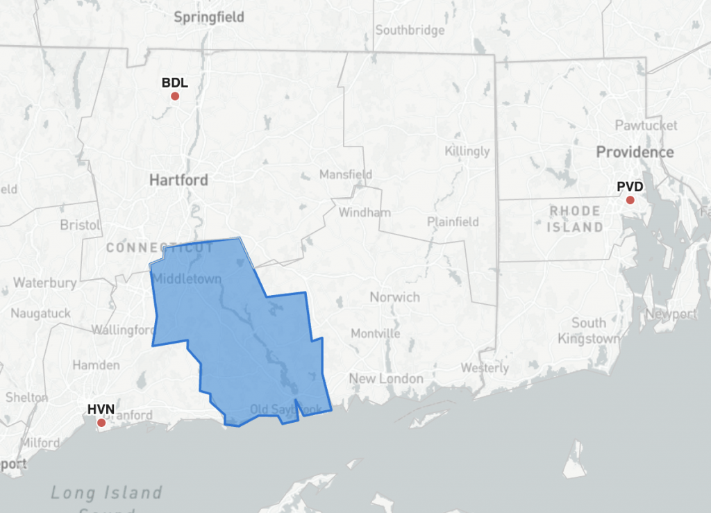
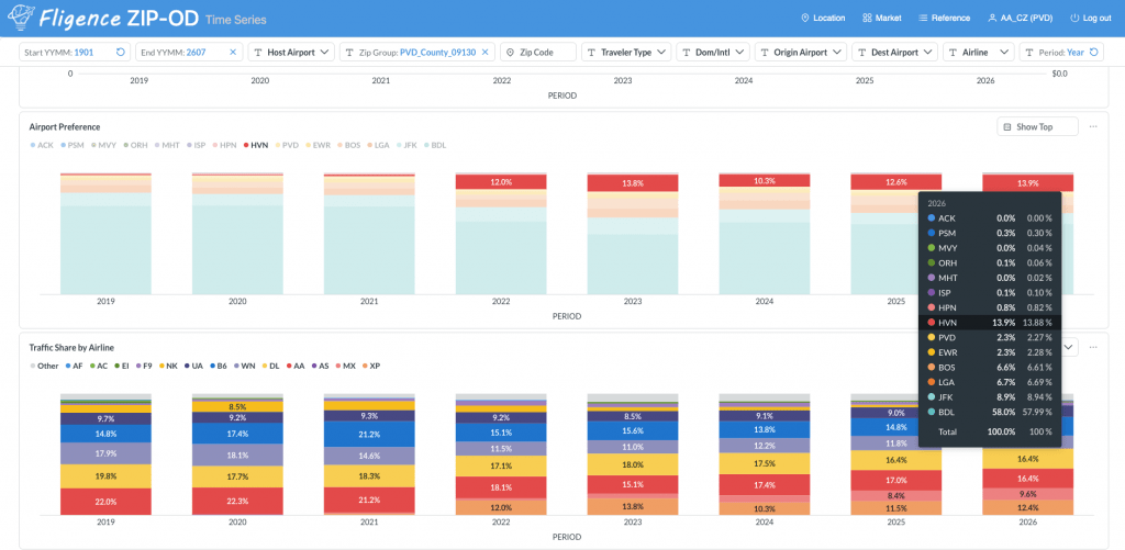
For example, at the Lower Connecticut River Valley Planning Region (see Fig. 3), New Haven Airport (HVN)‘s market share increased from almost nothing in 2019 to 13.9% in 2026, as shown in the Airport Preference chart in Fig. 4. For Bradley International Airport (BDL), the next question is not simply whether passenger leakage has increased. The more useful question is:
What changed at the competing airport, HVN?
The answer may point to a specific airline, new destination, schedule improvement, or geographic market where passenger behavior has shifted.
In this example, HVN’s market share growth was driven largely by new air service introduced by Avelo Airlines (XP) and Breeze Airways (MX). Their respective shares within the Lower Connecticut River Valley Planning Region are also displayed in the Traffic Share by Airline chart in Fig. 4. By connecting changes in airport market share with airline-level traffic share, BDL can better understand which competitors are gaining passengers and what is driving the shift.
Create a Competitive Airport Profile
A useful competitor profile should go beyond a list of nearby airports. For each important competing airport, Air Service Development teams can examine:
- Passenger volume captured from the target market
- Share of resident passenger demand
- Geographic sources of those passengers
- Top destinations
- Airlines carrying the demand
- Nonstop destinations available
- Fare position
- Changes over time
This creates a much more actionable understanding of competition than simply knowing the distance between airports.
How Fligence Identifies Competing Airports
FlightBI’s Fligence Catchment and Leakage analysis allows airport teams to identify which airports residents within their market actually use.
Rather than defining competitors in advance based only on distance, the analysis uses passenger behavior to reveal the airports capturing demand from the target market.
Airport teams can examine:
- which competing airports passengers use
- how much passenger demand each airport captures
- where those passengers originate
- how competitor patterns change geographically
- how airport choice changes by destination
This allows airports to identify both obvious nearby competitors and less obvious airports that become important for particular markets or passenger segments.
Other Fligence analyses can then provide additional context around fares, passenger location, demographics, and route-level demand.
From Competitor Identification to Air Service Strategy
Knowing which airports capture passengers becomes particularly valuable when connected to individual route opportunities.
A useful Air Service Development workflow is:
Identify the destination with substantial local demand
→ Determine which airports those passengers currently use
→ Identify the airlines carrying that demand
→ Evaluate the service and fare differences
→ Assess whether improved local service could capture a portion of the market
This turns competitor identification into a practical part of route-development analysis.
The Bottom Line
The answer to “Which airports are our passengers leaking to?” should come from actual passenger behavior rather than assumptions about which airports are closest.
In many regions, passengers distribute themselves among several competing airports, and the competitive pattern can vary significantly by geography and trip type. CVG, for example, competes with multiple airports across its broader regional market, while OAK faces major competitors in different directions across the Bay Area. Hagerstown illustrates how travelers may look in the same general direction but divide their airport choices among BWI, IAD, and DCA. In Southwest Florida, RSW, SRQ, PGD, and TPA all participate in the broader regional market, while Miami (MIA) becomes substantially more important when the analysis shifts from domestic to international travel.
For airport Air Service Development teams, the most useful analysis identifies:
which airports capture local passengers, how much demand each captures, where those passengers live, and how the competitive pattern changes by destination.
That turns a general understanding of passenger leakage into a detailed picture of where the airport’s passenger demand is actually going.