
Population migration shapes long-term air travel demand. Every family that relocates creates new travel patterns—return visits to friends and relatives, business trips, vacation travel, and connections between their former and new communities.
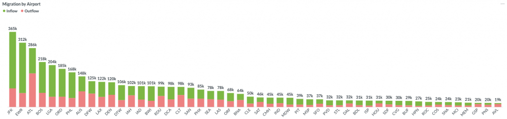
The Fligence Migration Dashboard helps airport air service development teams visualize these migration patterns using IRS tax return data in an intuitive interactive map. Instead of analyzing static tables, you can instantly identify where people are moving to and from your region, revealing markets with growing long-term travel relationships.
Whether you’re evaluating a new route opportunity, supporting airline discussions, or understanding demographic shifts, the Migration Dashboard provides another layer of market intelligence beyond historical passenger traffic.
Why Migration Matters
Passenger traffic reflects where people traveled in the past. Migration reveals where people will likely continue traveling in the future.
Every family that relocates creates an ongoing relationship between two communities. These connections often generate recurring trips for holidays, family visits, business, and special occasions long after the move.
At the same time, counties experiencing sustained population growth typically generate increasing air travel demand simply because more people live there.
By combining migration flows with population change, airports gain valuable insight into future market opportunities that may not yet appear in historical passenger data.
Three Ways to Analyze Future Demand
Inbound Migration
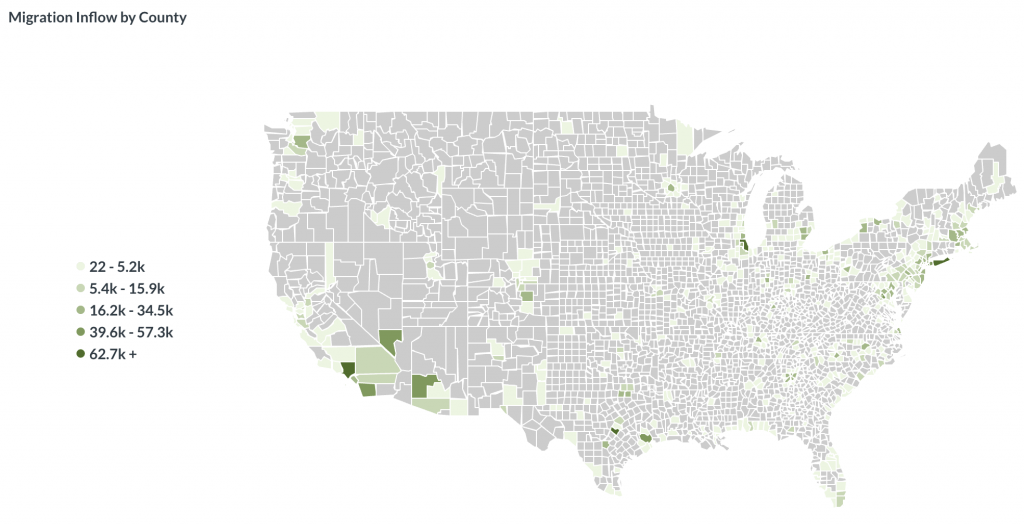
Where are your future passengers moving from?
The Inflow Map shows the counties that have contributed new residents to your region over the selected time period.
These new residents frequently maintain personal and business connections with their former communities, creating future VFR travel demand.
Airport applications include:
- Identify emerging origin markets for future passenger traffic
- Support new route opportunities based on growing population connections
- Understand where new residents maintain long-term travel ties
Outbound Migration
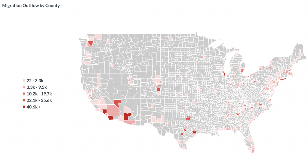
Where have your former residents relocated?
The Outflow Map shows where people leaving your region have moved.
Although these residents now live elsewhere, they often return to visit family, friends, businesses, and community events, generating future inbound passenger traffic.
Airport applications include:
- Identify destination markets with strong long-term community connections
- Understand where former residents continue to generate return travel
- Evaluate underserved VFR markets
Net Migration
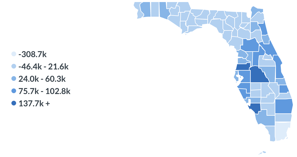
Is your region gaining or losing population?
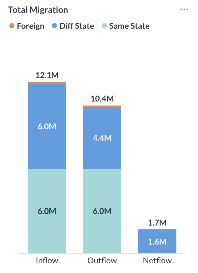
The Net Migration Map and accompanying charts summarize the overall population change resulting from migration.
Growing regions generally experience increasing long-term passenger demand because a larger population creates more business, leisure, and VFR travel.
Net migration helps airports:
- Monitor long-term changes in market size
- Identify rapidly growing regions that may require additional air service
- Compare migration performance among counties or metropolitan areas
- Support long-range forecasting and strategic planning
Powerful Analysis Tools
Interactive County-to-County Maps
Explore migration patterns through intuitive maps that instantly display inflows, outflows, and net migration across the United States.
Multi-Year Trend Analysis
Analyze one year or combine multiple years of IRS migration data to identify sustained migration trends rather than temporary fluctuations.
Income (AGI) Filter
Migration patterns differ across income levels.
Filter migration flows by Adjusted Gross Income (AGI) to focus on households that are more likely to generate discretionary or premium air travel.
Air Travel Distance Filter
Not every move creates airline demand.
The dashboard allows users to analyze only migration between counties separated by a minimum driving time selected by the user. This removes local relocations and focuses the analysis on migration flows that are more likely to generate air travel.
Built for Airport Air Service Development
The Migration Dashboard helps answer questions such as:
- Which counties are sending the largest number of new residents into our region?
- Where have our former residents relocated?
- Which migration markets are most likely to generate future VFR traffic?
- Which higher-income migration flows represent the greatest revenue opportunity?
- How has our regional population changed due to migration?
- Which long-distance migration markets should airlines consider for future service?
- Are emerging migration patterns consistent with changes in passenger demand?
Migration Data, Designed for Aviation
The dashboard is powered by annual county-to-county migration statistics based on IRS tax returns, including:
- County-to-county migration flows
- Number of tax returns and exemptions (estimated movers)
- Adjusted Gross Income (AGI)
- Multi-year historical migration trends
Fligence transforms these complex government datasets into an aviation-focused decision support tool specifically designed for airport air service development.
Request a Demo
See how the Fligence Migration Dashboard can help your airport identify emerging travel markets, understand long-term population connections, and strengthen the business case for new or expanded air service. Request a personalized demo to explore migration inflows, outflows, net population change, AGI-based market segments, and long-distance county-to-county flows for your airport’s region.