
Passenger leakage is rarely distributed evenly across an airport’s market. Some ZIP codes may strongly favor the local airport, while nearby communities generate large numbers of travelers who use other airports.
Identifying which ZIP codes have the highest passenger leakage helps airport Air Service Development and Marketing teams locate where uncaptured passenger demand is concentrated.
But “highest leakage” can mean two different things:
- Highest leakage rate — the percentage of travelers in a ZIP code using other airports.
- Highest leakage volume — the actual number of passenger trips from a ZIP code using other airports.
For airport decision-making, both measures are important.
Leakage Rate vs. Leakage Volume
Consider these three hypothetical ZIP codes:
| ZIP Code | Total Air Demand | Local Airport | Other Airports | Leakage Rate |
|---|---|---|---|---|
| ZIP A | 5,000 | 500 | 4,500 | 90% |
| ZIP B | 30,000 | 12,000 | 18,000 | 60% |
| ZIP C | 50,000 | 30,000 | 20,000 | 40% |
ZIP A has the highest leakage rate at 90%. But only 4,500 passenger trips are leaking. ZIP C has the lowest leakage rate of the three at 40%, yet it generates 20,000 leaked passenger trips—more than four times the leakage volume of ZIP A. So which ZIP code has the highest leakage?
It depends on what you are trying to measure. If you want to identify where the airport has its weakest position, ZIP A stands out. If you want to identify where the largest number of passengers are using other airports, ZIP C is more important.
Start by Ranking ZIP Codes by Leaked Passenger Volume
For many airport applications, one of the most useful views is a ranking of ZIP codes by the number of passengers using other airports.
For example:
| Rank | ZIP Code | Total Demand | Local Airport Passengers | Leaked Passengers | Leakage Rate |
| 1 | ZIP A | 45,000 | 20,000 | 25,000 | 56% |
| 2 | ZIP B | 38,000 | 16,000 | 22,000 | 58% |
| 3 | ZIP C | 30,000 | 10,000 | 20,000 | 67% |
| 4 | ZIP D | 22,000 | 7,000 | 15,000 | 68% |
| 5 | ZIP E | 12,000 | 2,000 | 10,000 | 83% |
This ranking immediately shows where the largest pools of uncaptured passenger demand are located. ZIP E has the highest leakage rate, but ZIP A has 2.5 times as many leaked passengers. For an airport trying to understand the scale of geographic opportunities, that distinction can be significant.
Map Leakage Instead of Looking Only at a Ranking
A ranked table tells an airport which individual ZIP codes have the most leakage. A map reveals something different: geographic patterns.
Several high-leakage ZIP codes located next to one another may form a larger geographic corridor or submarket.
For example, an airport might discover that high leakage is concentrated:
- Along a major interstate leading toward another metropolitan area
- In rapidly growing outer suburbs
- On one side of the airport’s broader market
- In communities near a state border
- In higher-income suburban areas
- In areas with particularly strong demand for certain destinations
These patterns may be difficult to recognize from a spreadsheet. But a ZIP-level leakage map can turn thousands of passenger records into a geographic picture that airport teams can interpret much more quickly.
Look for Leakage Clusters
Individual ZIP codes are useful analytical units, but airports should also look for clusters of neighboring ZIP codes with similar behavior.
Suppose one ZIP code generates 8,000 leaked passengers. By itself, it may not appear particularly significant. But if six neighboring ZIP codes each generate between 6,000 and 10,000 leaked passengers, the combined area could represent more than 50,000 passenger trips. That cluster may represent a meaningful submarket.
This is especially important for airport marketing because campaigns are often more practical when aimed at a broader geographic corridor or community rather than one isolated ZIP code. For Air Service Development, clusters can demonstrate that passenger demand for a market is geographically concentrated rather than scattered across a very large region.
High-Demand, Moderate-Leakage ZIP Codes Can Be Especially Important
Airport teams should be careful not to focus exclusively on ZIP codes with extremely high leakage percentages. A ZIP code with an 85% leakage rate may simply be located at the outer edge of the airport’s market. A ZIP code with a 45% leakage rate but extremely high passenger demand may be strategically much more interesting.
Consider:
ZIP A:
8,000 total passengers × 85% leakage = 6,800 leaked passengers
ZIP B:
50,000 total passengers × 45% leakage = 22,500 leaked passengers
ZIP B has a much stronger existing relationship with the airport, yet it also contains more than three times as many passengers using other airports. These high-demand, moderate-share markets can be particularly valuable areas for further analysis.
Consider the ZIP Code’s Contribution to Total Airport Leakage
Another useful measure is: What percentage of all leaked passengers comes from this ZIP code?
Suppose an airport has 300,000 leaked passenger trips across its broader market. If one ZIP code generates 24,000 of them, that ZIP code accounts for:
24,000 ÷ 300,000 = 8% of total leakage
A group of ten ZIP codes might account for 40% or 50% of the airport’s entire leakage pool. This concentration matters. Rather than treating hundreds of ZIP codes equally, airport teams can identify the relatively small number of geographic markets responsible for a large portion of uncaptured demand.
A useful analysis might therefore show:
- Top 10 ZIP codes → 32% of total leakage
- Top 25 ZIP codes → 55%
- Top 50 ZIP codes → 73%
This creates a practical way to prioritize the market.
Destination-Level Leakage Can Change the ZIP-Code Ranking
The ZIP codes with the most overall leakage may not be the ZIP codes with the most leakage for a specific destination. Suppose ZIP A ranks first in total leaked passengers. For Nashville demand, however, ZIP C may be the largest source of passengers using other airports. For Cancun, ZIP D may dominate. For Boston, ZIP B may be the largest.
This matters when an Air Service Development team is evaluating a particular route. Instead of asking only:
“Which ZIP codes have the most leakage overall?”
the team can ask:
“Which ZIP codes generate the most leaked passengers to this destination?”
That produces a geographic picture directly related to the route opportunity being evaluated.
Combine Leakage Volume with Distance from the Airport
Geographic context also matters when interpreting high-leakage ZIP codes.
Imagine two ZIP codes each generate 15,000 leaked passengers:
- ZIP A: 35 minutes from the airport
- ZIP B: 110 minutes from the airport
Although their leakage volumes are identical, they represent very different situations. High leakage from ZIP B may be less surprising because the community is located near the outer edge of the airport’s geographic reach. High leakage from ZIP A may deserve more attention because substantial passenger demand is using other airports despite being relatively close to the local airport.
This does not automatically mean those passengers can be recovered, but it helps airport teams prioritize where additional investigation is warranted.
Real-World Example: Sonoma County Airport (STS)
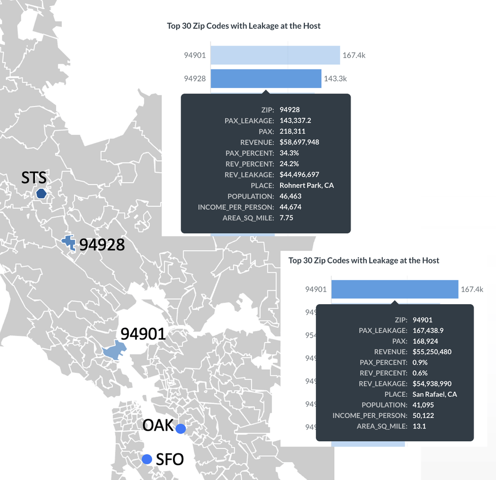
Using Sonoma County Airport (STS) as an example, the airport experiences significant passenger leakage to nearby San Francisco International Airport (SFO) and Oakland San Francisco Bay Airport (OAK).
Among ZIP codes within a one-hour drive of STS, 94901 (San Rafael, CA) has the highest passenger leakage. However, San Rafael is actually closer to SFO and OAK than to STS. Given the broader air service and often more competitive fares available at these larger airports, much of this leakage may be difficult for STS to recover. Therefore, ZIP 94901 should not necessarily be a high-priority market for STS.
ZIP 94928 (Rohnert Park, CA) presents a different opportunity. Although its total leakage is lower than that of ZIP 94901, passengers from this ZIP code still generate 143,337 trips a year through airports other than STS. More importantly, STS already captures about one-third of the area’s passenger demand, and Rohnert Park is much closer to STS than to either SFO or OAK.
These factors suggest that travelers in Rohnert Park already view STS as a viable airport, while a substantial amount of demand remains uncaptured. As a result, ZIP 94928 may represent a more addressable leakage market for STS than ZIP 94901, making it a stronger target for efforts to win additional passenger traffic.
Create a ZIP-Code Opportunity Matrix
A useful way to prioritize ZIP codes is to consider passenger demand and leakage together.
The market can be divided conceptually into four groups:
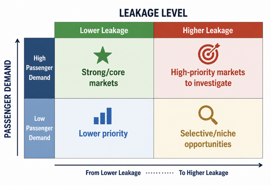
The upper-right category—high passenger demand combined with high leakage—is often the most interesting. These ZIP codes contain substantial numbers of air travelers while a meaningful portion of those travelers use other airports.
However, this should be treated as an opportunity-screening framework rather than proof that the passengers are recoverable. Air service, fares, destination patterns, geography, and other factors still need to be examined.
How Air Service Development Teams Can Use ZIP-Level Leakage
For Air Service Development teams, identifying high-leakage ZIP codes can help reveal the geographic source of demand behind a route opportunity.
Instead of presenting only:
“Our market generates 70 PDEW to this destination,”
an airport can also show:
where those passengers live.
If a substantial portion of the demand is concentrated in communities reasonably accessible to the airport, that geographic evidence can strengthen the market story.
ZIP-level analysis can help teams:
- Identify geographic concentrations of unserved or underserved demand
- Support route-specific market analysis
- Demonstrate the geographic depth of a proposed market
- Identify communities contributing substantial demand
- Prioritize areas for additional research
- Create more informative airline presentation maps
How Airport Marketing Teams Can Use ZIP-Level Leakage
For marketing teams, high-leakage ZIP codes provide a starting point for identifying geographic areas where campaigns may have room to influence airport usage.
The most useful targets are not necessarily the ZIP codes with the highest leakage percentages. Marketing teams may instead prioritize areas with a combination of:
- Substantial total air travel demand
- Meaningful leaked passenger volume
- Reasonable accessibility to the airport
- Relevant available air service
- Passenger characteristics aligned with the campaign
For example, if the airport launches a new nonstop route, marketing can identify ZIP codes containing large numbers of travelers already flying to that destination through other airports. That is much more targeted than advertising uniformly throughout the entire catchment.
How Fligence Identifies High-Leakage ZIP Codes
FlightBI’s Fligence Traffic Leakage Dashboard allows airport teams to examine passenger demand geographically at the ZIP-code level.
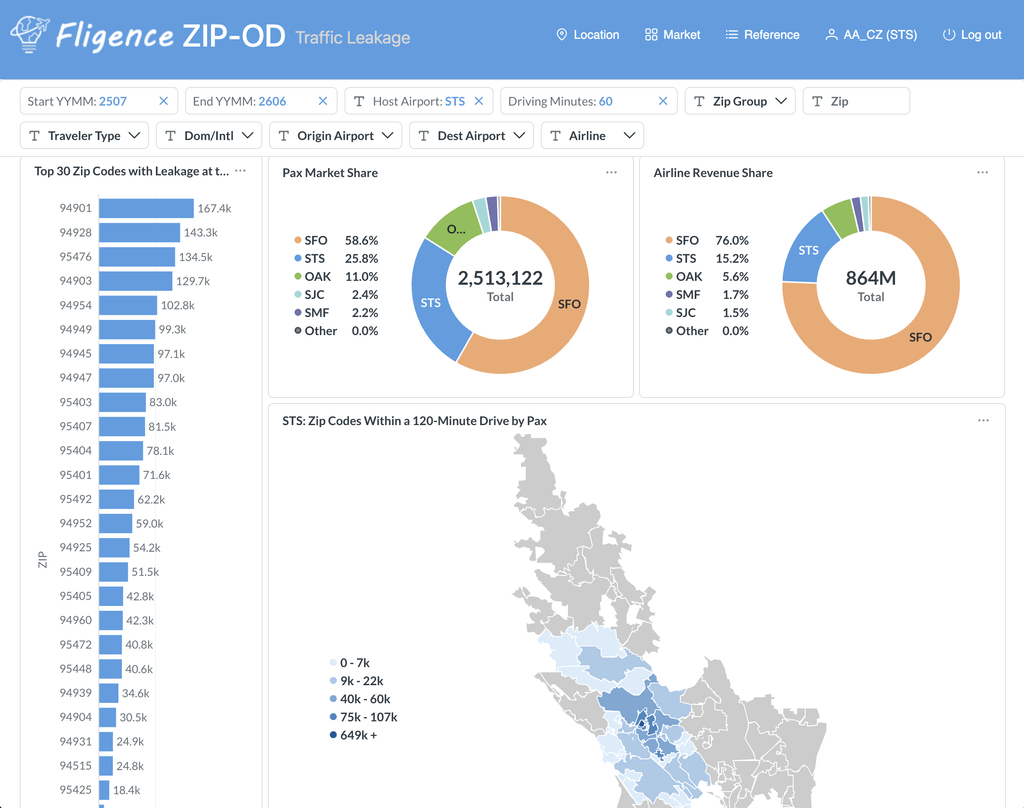
Rather than seeing leakage only as one airport-wide percentage, users can identify:
- Total passenger demand by ZIP code
- Passengers using the target airport
- Passengers using other airports
- Leakage volume
- Leakage rate
- Geographic concentrations of leakage
- Destination-specific passenger patterns
This makes it possible to rank ZIP codes, map them, identify clusters, and distinguish between high-percentage leakage areas and high-volume leakage markets. The analysis can then be combined with other Fligence information such as passenger location, fares, demographics, and route-level demand to investigate why particular geographic opportunities stand out.
From a Leakage Map to an Actionable Market
The most useful ZIP-level leakage analysis does not end with a map. It progresses from:
Where is leakage occurring?
to:
Where is the largest volume of leakage concentrated?
then:
Which of those areas contain meaningful opportunities for our airport?
A practical prioritization process can consider:
1. Total passenger demand
Is the ZIP code a meaningful air travel market?
2. Leaked passenger volume
How many passengers are actually using other airports?
3. Leakage rate
How strong or weak is the airport’s current position?
4. Geographic concentration
Are neighboring ZIP codes showing the same pattern?
5. Route relevance
Are these passengers traveling to destinations important to the airport?
6. Addressability
Does the airport have—or could it realistically provide—service that meets their needs?
This converts a ZIP-level leakage analysis from a descriptive map into a tool for prioritizing airport opportunities.
The Bottom Line
The ZIP codes with the highest passenger leakage are not necessarily those with the highest leakage percentages.
Airports should evaluate both:
how large a percentage of travelers use other airports
and
how many actual passenger trips that represents.
A small ZIP code with 90% leakage may matter less than a major passenger-generating ZIP code with 45% leakage.
By ranking leaked passenger volume, mapping geographic clusters, examining destination-specific patterns, and comparing leakage with total air travel demand, airport teams can identify the communities that contribute most significantly to uncaptured passenger demand.
The key question is therefore not simply:
“Where is our leakage rate highest?”
It is:
“Where is the largest meaningful concentration of passenger demand that our airport is not currently capturing?”