
Knowing where airport passengers live helps airports understand their true geographic market, measure airport market share, and target marketing more effectively.
Airport passenger origins can be analyzed at the ZIP-code level to show where resident travelers come from and how passenger demand varies across an airport’s market. Instead of assuming that passengers come from within a fixed radius or drive-time boundary, passenger-location analysis provides a more detailed picture of the communities actually generating air travel demand.
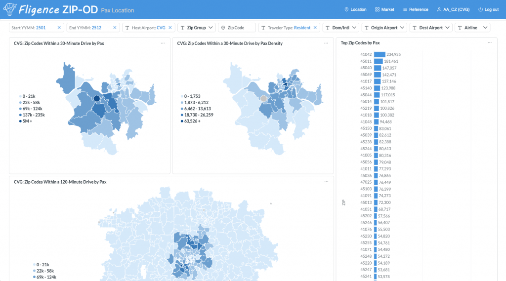
With the Residents selector in FlightBI’s Fligence Pax Location Dashboard, airports can analyze where their resident passengers live and explore passenger demand geographically.
Why Does Passenger Location Matter?
Airport traffic statistics tell you how many passengers use an airport, but they generally do not show where those passengers live.
For airport planning, air service development, and marketing, geography matters.
Some airports draw most of their passengers from communities close to the airport. Others serve large regional markets extending across multiple counties or metropolitan areas. Passenger distributions can also be uneven, with certain communities generating substantially more air travel than others.
Understanding this distribution helps airport teams answer questions such as:
- Which ZIP codes generate the most passengers?
- Where are our largest concentrations of passengers?
- How widely distributed is our passenger base?
- How far from the airport do our passengers live?
- Which cities and communities contribute the most passengers?
- How does passenger geography differ by destination?
- How does our passenger distribution change over time?
These insights provide a more detailed understanding of an airport’s geographic market than population or drive-time boundaries alone.
How Can Airports Determine Where Their Passengers Live?
A useful approach is to estimate resident passenger origins at a detailed geographic level, such as ZIP code.
Instead of simply counting the population surrounding an airport, passenger-location analysis estimates where actual air travelers originate.
For example:
| ZIP Code | Estimated Resident Passengers | Share of Airport’s Resident Passengers |
|---|---|---|
| ZIP A | 35,000 | 8.5% |
| ZIP B | 28,000 | 6.8% |
| ZIP C | 22,000 | 5.3% |
| ZIP D | 15,000 | 3.6% |
This type of analysis reveals both the volume and geographic distribution of an airport’s passenger base.
Mapping these results makes it easier to identify major passenger concentrations, geographic corridors, outlying markets, and areas that contribute disproportionately to airport traffic.
Analyze Resident Passenger Locations with Fligence
The Fligence Pax Location Dashboard allows airport teams to explore where passengers are geographically located.
By selecting Residents as Traveler type, users can focus specifically on passengers who live in the airport’s broader market and get a detailed picture of the airport’s actual passenger footprint.
Identify Passenger Concentrations
Passenger demand is rarely distributed evenly across an airport’s surrounding region.
Some ZIP codes may generate substantially more passengers because of population, household income, employment, accessibility, travel propensity, or other characteristics.
A passenger-location map can reveal geographic patterns that may not be obvious from a spreadsheet.
For example, an airport might discover that a large share of its resident passengers comes from:
- Several high-density ZIP codes near the airport
- A major suburban corridor
- Communities along an interstate highway
- A growing metropolitan area farther from the airport
- High-income communities with greater air travel propensity
Understanding these concentrations helps airport teams see the geographic structure of their passenger market.
How Far Away Do Airport Passengers Live?
Passenger-location data can also help airports understand how far their passengers travel to reach the airport.
Rather than assuming that the airport serves everyone within a predetermined 30-, 60-, or 90-minute drive-time area, airports can examine the actual locations of passengers using the airport.
A large hub may attract passengers across a wide geographic region, while a smaller airport may have a more concentrated passenger base. Airports offering specialized or unique nonstop service may also attract passengers from considerably farther away.
This provides a behavioral complement to traditional drive-time catchment analysis. (See more details here)
Passenger Distribution Can Differ by Destination
An airport does not necessarily have the same geographic passenger distribution for every destination.
Consider an airport offering nonstop service to New York City and Grand Cayman. New York is served by multiple airports, including JFK, LGA, and EWR, while GCM is the only airport serving Grand Cayman. Passengers traveling to Grand Cayman may drive several hours to this airport if it offers their only nonstop option. The same traveler may choose an airport closer to home for a New York trip if that airport also offers nonstop service to the New York area.
Passenger distribution may also be very different for international destinations. For example, Korean communities in the Washington, D.C. area are concentrated in places such as Centreville and Annandale, Virginia. For a flight to South Korea, an airport may see a higher concentration of passengers from these communities than from other areas.
Analyzing passenger origins by destination can therefore help Air Service Development teams understand the geographic depth of demand supporting individual markets.
Teams can ask:
- Where do passengers traveling to this destination live?
- How concentrated is that demand?
- How far are travelers willing to travel to access this service?
- Which communities generate the greatest demand for the destination?
This can provide useful geographic evidence when evaluating existing or proposed air service.
Understand the Airport’s Core Geographic Market
Passenger-location data can help identify the communities that form the airport’s core passenger base.
Rather than defining the core market solely according to distance, airports can identify areas based on actual passenger contribution.
For example, an airport might find that:
- The closest 20 ZIP codes account for 35% of resident passengers.
- The top 50 ZIP codes account for 60%.
- The top 100 ZIP codes account for 80%.
This type of cumulative analysis shows how concentrated or dispersed the airport’s passenger base really is.
For some airports, a relatively small number of nearby communities may account for most passengers. For others, demand may be spread across a much larger region.
Compare Passenger Distribution with Population
Population and passenger distribution are not necessarily the same.
A highly populated ZIP code may generate relatively few air travelers, while another community with fewer residents may generate disproportionately high passenger volume.
Factors such as household income, employment, age, business activity, tourism, and travel propensity can all influence air travel demand.
Comparing passenger origins with demographic information can therefore help airports understand not only where passengers live, but also why certain areas contribute more travelers than others.
This can be particularly useful when identifying emerging passenger markets or understanding changes in an airport’s geographic demand base.
Track How Passenger Geography Changes Over Time
Passenger distribution is not static.
Population growth, migration, new housing development, economic activity, changing airline service, and transportation infrastructure can gradually shift where an airport’s passengers live.
Tracking passenger locations over time can reveal:
- Growing sources of passenger demand
- Changes in the airport’s geographic footprint
- Emerging suburban or exurban markets
- Shifts in passenger concentration
- Changes associated with new air service
- Long-term changes in the communities served by the airport
For airport planners and Air Service Development teams, these trends can provide an early indication of how the airport’s underlying market is evolving.
How Air Service Development Teams Can Use Passenger Location Data
For Air Service Development teams, geographic passenger distribution provides evidence about the size and reach of the airport’s market.
Teams can use passenger-location information to:
- Show airlines where airport passengers originate
- Identify the communities generating the most passenger demand
- Demonstrate the geographic reach of the airport
- Analyze passenger origins for specific destinations
- Understand how concentrated or dispersed route demand is
- Support catchment and market-size analysis
- Strengthen maps and exhibits used in airline presentations
Instead of relying only on population within a fixed radius, airports can demonstrate the geographic distribution of actual passenger demand.
How Airport Marketing Teams Can Use Passenger Location Data
Passenger-location analysis also provides a foundation for geographic marketing decisions.
Marketing teams can identify the communities that generate substantial numbers of airport passengers and understand how the airport’s audience is distributed across its region.
These insights can support:
- Geographic advertising strategies
- New-route marketing
- Community outreach
- Digital campaign targeting
- Outdoor advertising placement
- Market-specific messaging
- Analysis of campaign reach
More detailed opportunity and leakage analysis can then be used separately to determine where additional passenger acquisition efforts should be concentrated.
Residents and Visitors Should Be Analyzed Separately
For many airports, particularly those serving tourism destinations, resident and visitor passenger distributions can look very different.
A resident analysis asks:
Where do the people who live in our market and use the airport come from?
A visitor analysis asks:
Where do arriving travelers stay or spend time within our destination?
Separating the two provides a clearer geographic picture.
In Fligence platform, we use air mobility data to analyze residents patterns and hotel data for visitor patterns. The Traveler Type selector in the Fligence Pax Location Dashboard allows airport teams to focus specifically on resident passenger origins or visitor destinations.
Passenger Location Helps Define the Airport’s True Catchment
Understanding where passengers live is one of the foundations of airport catchment analysis.
A traditional catchment might be defined using a 60- or 90-minute drive-time boundary. Passenger-location analysis adds observed geographic demand to that picture.
Instead of assuming that everyone within a boundary contributes equally to the airport, airports can see where their passengers actually originate and how passenger volume changes across the region.
This creates a more realistic picture of the airport’s geographic footprint.
The Bottom Line
Knowing where your airport’s passengers live provides a much deeper understanding of the geographic market your airport actually serves.
ZIP-level resident passenger analysis can reveal:
where passengers are concentrated, how far they live from the airport, which communities contribute the most traffic, how widely the passenger base extends, and how those patterns differ by destination and over time.
With the Traveler Type selector in FlightBI’s Fligence Pax Location Dashboard, airport Air Service Development and Marketing teams can explore these geographic patterns and use them to support catchment analysis, route development, airline presentations, market planning, and geographic marketing decisions.
Airport traffic statistics answer:
“How many passengers use our airport?”
Passenger-location analysis answers the next question:
“Where do they come from?”