
Airport markets are constantly changing. People move into a region. Others move away. Suburbs expand. New residential communities develop. Companies relocate employees. Retirees move to warmer climates. Families establish connections between their new homes and the places they previously lived.
These changes can gradually reshape where airport passengers come from and where they want to travel. For airport Air Service Development and Marketing teams, population growth and migration can help answer an important forward-looking question:
How is our future passenger market different from the market we serve today?
Understanding migration is particularly valuable because it provides more than a measure of population growth. It can reveal where new residents came from, creating potential air travel connections between the airport’s market and other regions.
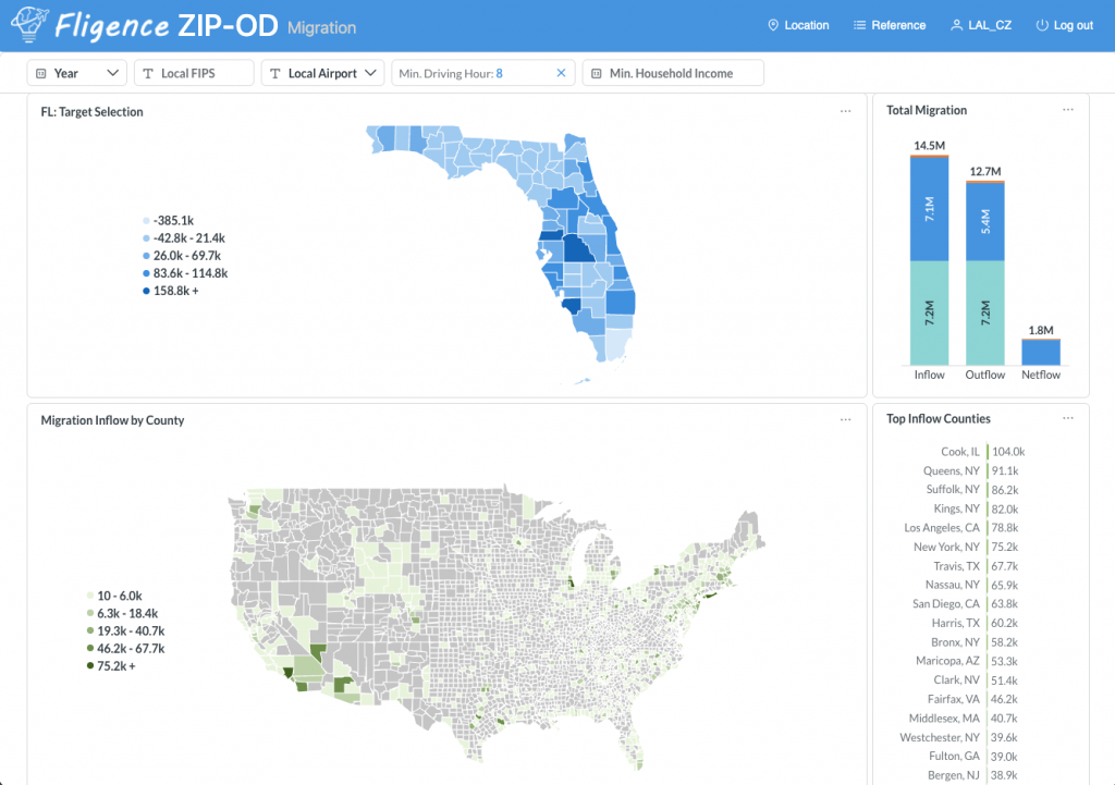
FlightBI’s Fligence ZIP-OD Migration Dashboard (Fig. 1) uses IRS migration data to show county-level migration trends and helps airport teams examine the airports associated with travel between migration origin and destination markets.
Population Growth Can Expand the Airport’s Passenger Base
At the most basic level, population growth increases the number of potential travelers living within an airport’s market. As shown in Fig. 1, Florida gained 1.8 million population from 2012 to 2023. That represents 1.8 million additional potential consumers of air travel.
If the characteristics and travel propensity of the population remain similar, this growth can contribute to increased:
- Originating passenger demand
- Leisure travel
- Visiting-friends-and-relatives travel
- Business activity
- Airport parking demand
But population growth alone does not tell the complete story. The characteristics and origins of those new residents can matter just as much as the number of people added.
Not All Population Growth Has the Same Aviation Impact
Consider the Travis county in Texas and the Orange county in California. Each of them had about 1 million in-migration in a decade from 2014 to 2023. However, Orange county’s in-migration is primarily young people relocating from nearby counties. Travis county’s growth includes professionals relocating from Los Angeles, Chicago, Miami, Phoenix, San Diego, Seattle and New York (see Fig. 2). Please note those numbers are not net gains because residents in those countries also moved out to other places.
| County | In-migration 2014-2023 | Share from the Same State |
| Travis, TX (Austin) | 1,015,168 | 42.5% |
| Orange, CA | 1,009,198 | 68.0% |
Source: IRS Migration Data
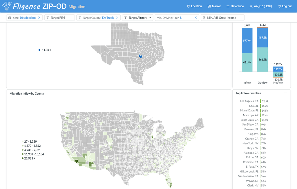
Both counties had similar number of people moving in. Their impact on air travel could be very different. Travis county’s new residents may maintain strong personal and professional relationships with the places they previously lived, potentially creating additional long-distance air travel demand.
This is why airports should look beyond:
How much population are we growing?
and also ask:
Where is that population growth coming from?
In fact, most migration happens among neighboring counties. Such migration won’t generate new air service demand. The Fligence Migration Dashboard includes a drive-time control that allows airport teams to filter migration source and destination markets based on their driving distance from one another. This helps focus the analysis on long-distance migration relationships where air travel is more relevant, while filtering out nearby moves that are more likely to rely on ground transportation.
Migration Creates Geographic Connections
When people relocate, their relationships do not necessarily relocate with them. New residents may still have family, friends, business relationships, former employers, professional networks and property in their previous communities. These connections can create recurring travel between the old and new locations.
For example, if a large number of households move from the Los Angeles area to Austin, TX, some of those residents may continue traveling frequently to Los Angeles. At the same time, friends and family in Los Angeles may travel in the opposite direction to visit them. Migration can therefore create demand in both directions.
Migration Can Be an Early Indicator of Future Air Travel Demand
Traditional O&D passenger data tells airports where people are traveling today. Migration data provides a different perspective. It can reveal demographic relationships that may strengthen future travel demand.
Suppose an airport’s region has experienced several years of strong migration from New York, Chicago, Los Angeles and South Florida. Those migration flows may help explain emerging demand to these regions – or identify markets worth monitoring.
Migration should not replace observed O&D demand. Instead, it provides another layer of evidence that helps explain why a city-pair relationship may be strengthening.
Look at Trends, Not Just One Year
Migration can fluctuate substantially from year to year. A single year may be influenced by:
- Economic conditions
- Housing costs
- Remote-work trends
- Major employers
- Natural disasters
- Military relocations
- Retirement patterns
For airport planning, a multi-year trend is usually more informative than one isolated observation. If a county consistently gains residents from the same metropolitan area over several years, the relationship may be more strategically meaningful than a one-time increase.
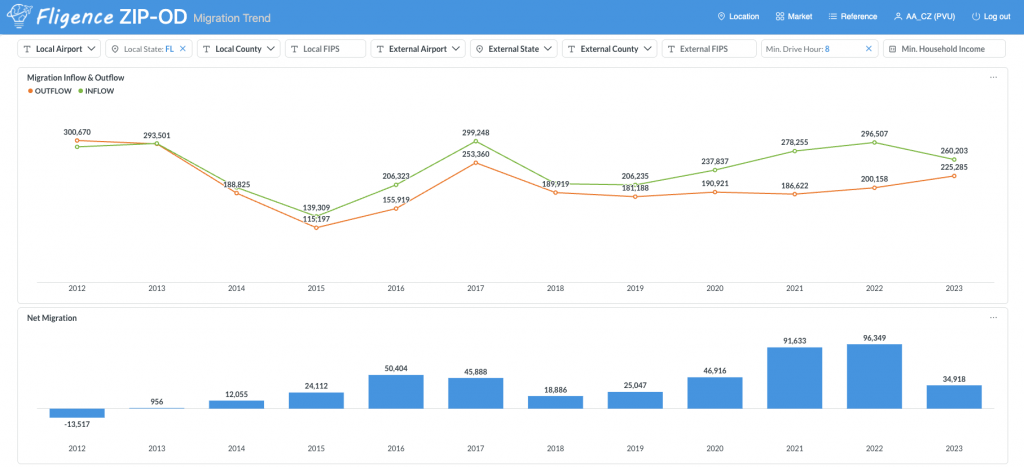
Fligence’s Migration Trend Dashboard (Fig. 3) allows airport teams to examine migration trends over time rather than viewing population movement as a static number.
Net Migration Shows Whether a Market Is Gaining or Losing Residents
A useful starting point is the difference between people moving into and out of a county.
For example between 2012 and 2023:
| Los Angeles County, CA | Polk County, FL (see Fig. 4) |
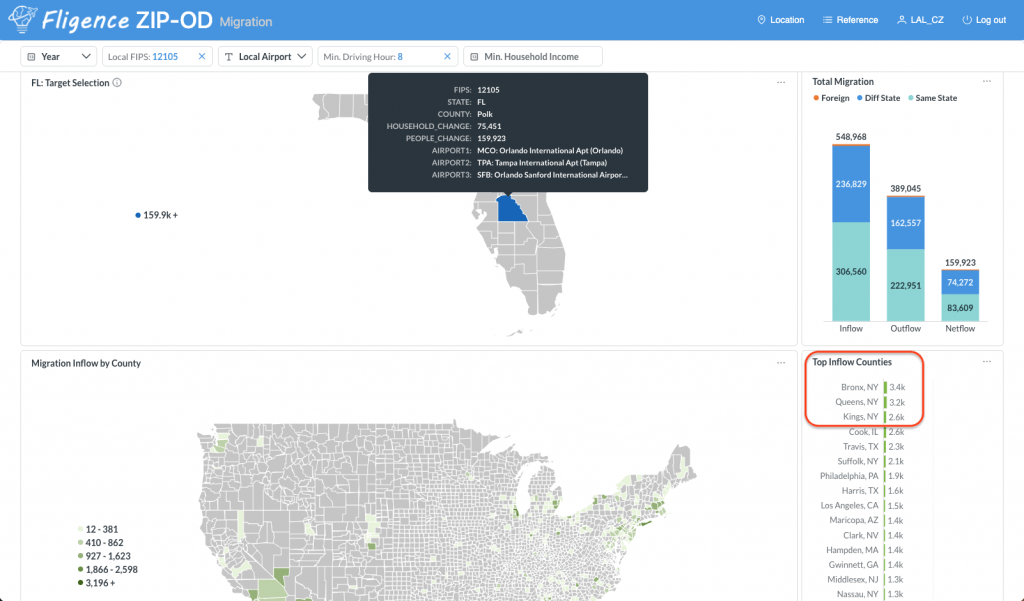
| In-migration: 2.3 Million Out-migration: 3.3 Million Net migration: -1.0 Million | In-migration: 549 Thousand Out-migration: 389 Thousand Net migration: 160 Thousand |
The Polk County is gaining residents through migration while the Los Angeles County is losing them.
For airport teams, persistent positive migration can indicate an expanding local passenger base, while sustained out-migration may suggest slower future growth. But net migration alone still hides an important part of the story.
In-Migration and Out-Migration Should Be Examined Separately
Between 2012 and 2023, Greene County, North Carolina had: 11,492 people moving in and 11,490 people moving out. Net migration is almost zero. Looking only at the net figure might suggest nothing important is happening. In reality, 22,982 people changed locations. Those movements can create substantial geographic relationships with other markets.
For air service analysis, both directions matter. An airport may therefore want to understand:
Where are people moving here from?
and
Where are people leaving for?
The answers can reveal relationships that disappear when migration is reduced to a single net number.
High-Income Migration Matters More
Migration can change not only the number of people in a market but also its economic characteristics. IRS migration data can provide information related to adjusted gross income associated with migration flows. This can help airports distinguish between: Population growth and Economic growth associated with migration.
For example, two counties might each gain 10,000 residents. If one is attracting substantially higher-income households, its future air travel potential may develop differently.
Higher-income migration can contribute to changes in:
- Travel propensity
- Premium demand
- International travel
- Leisure travel
- Second-home activity
For airports, understanding the economic characteristics of migration is more important than total migration because high-income migration tends to generate more air traffic in the future. To facility analyzing high-income migration, Fligence Migration dashboard provides a Min. Household Income control for filtering out migration of families above certain income threshold.
Migration Can Reshape the Catchment from the Inside
Population growth is rarely distributed evenly across an airport’s market. One suburban county may grow rapidly while another remains relatively stable. Over time, this can shift the geographic center of passenger demand.
Suppose communities north of an airport experience significant population and income growth. Those areas may eventually account for a much larger portion of the airport’s originating passengers. This can affect:
- Passenger distribution
- Airport market share
- Ground access
- Marketing priorities
- Competitive-airport relationships
An airport’s catchment should therefore be viewed as dynamic rather than fixed.
Growth Near the Edge of the Catchment Can Be Especially Important
Population growth near the boundary between competing airports can have outsized strategic importance. Imagine a fast-growing suburban county located between Airport A and Airport B. Thousands of new households are being added, and both airports are within reasonable driving distance. Those new residents may not yet have deeply established airport habits. That can create an important opportunity. Airport Marketing teams may be able to establish awareness early, while Air Service Development teams can evaluate whether new demand from the growing area changes route opportunities. A fast-growing competitive market may therefore deserve more attention than an equally large but mature market where passenger behavior is already well established.
New Residents May Have Different Airport Habits
People who recently moved into a region may initially know little about the local airport. They may:
- Search larger airports automatically
- Use the airport they first discover online
- Follow airline loyalty habits established elsewhere
- Not know which nonstop destinations are available locally
This makes growing migration markets particularly interesting for airport Marketing teams. New residents can potentially be introduced to the airport before long-term travel habits are established. Campaigns might emphasize:
- Available nonstop destinations
- Airport proximity
- Parking convenience
- How to compare local flight options
The objective is to make the airport part of the new resident’s travel routine.
Migration Can Strengthen Visiting-Friends-and-Relatives Demand
One of the clearest aviation connections to migration is VFR – visiting friends and relatives.
Suppose 15,000 people relocate from metropolitan New York to an airport’s region over several years. Those new residents may travel back to New York to visit:
- Parents
- Children
- Friends
- Extended family
Meanwhile, those same people may receive visitors traveling from New York. This can create durable two-way demand even when the migration itself occurred years earlier. Migration corridors can therefore help explain why certain city pairs generate strong VFR traffic.
Migration Can Reveal Route Opportunities Beyond Major Business Markets
Air Service Development teams often focus on:
- Large O&D markets
- Business relationships
- Corporate headquarters
- Tourism
Migration adds another way of understanding route demand.
A destination may have Moderate current O&D but a rapidly strengthening population connection with the airport’s region. That does not automatically justify new service, but it may make the market worth monitoring. When migration trends align with:
- Growing O&D demand
- Strong leakage
- Competitive fares
- Limited nonstop service
the route story becomes more compelling.
Compare Migration with Existing O&D Demand
Migration is most useful when it is connected with actual aviation behavior.
Suppose an airport identifies strong migration from another metropolitan region. The next questions should be:
- How much passenger demand already exists between these markets?
- Is that demand growing?
- Which airports are passengers currently using?
- Is the traffic nonstop or connecting?
- How much demand leaks to competing airports?
This turns migration from a demographic observation into an air service planning tool.
Which Airports Serve the Migration Relationship?
A migration flow between two counties does not automatically translate into demand between two specific airports. Large metropolitan regions may contain several airports. For example, a migration relationship involving the New York region could potentially involve JFK, LGA, EWR or other airports depending on the traveler’s location and available service. Likewise, the airport serving the destination side may face competition from nearby airports.
Understanding which airports travelers actually use between the migration source and destination is therefore critical. This is where combining migration information with aviation data becomes particularly valuable.
Fligence Connects Migration Markets with Airport Usage
FlightBI’s Fligence ZIP-OD Migration Dashboard uses IRS migration data to show county-level migration relationships.
Airport teams can examine:
- In-migration
- Out-migration
- Net migration
- Migration trends
- Associated income information
and the geographic relationships between source and destination counties.
Importantly, Fligence can also show which airports are used for travel between the migration source and target markets. This helps bridge the gap between: People movement and air passenger movement.
Instead of simply identifying that residents are moving between two regions, airport teams can investigate how the aviation market associated with that relationship is currently served.
Lakeland Example: Migration from a Major Metro to a Growing Regional Market
Suppose a regional airport’s county has experienced sustained migration from the New York area. The airport could investigate:
- How many people are moving into the region from New York-area counties?
- Is that migration increasing or decreasing?
- How much income is associated with those incoming households?
- How much air passenger demand exists between the two regions?
- Which New York airports are being used?
- Which local or competing airports capture that traffic?
This provides a much richer picture than simply observing that the local population is growing. If migration, O&D demand, and passenger leakage all point in the same direction, the evidence for improved air service becomes stronger.
Lakeland Linder International Airport (LAL) is one such example. As shown in Fig. 4, the top three counties contributing migration to Polk County, Florida, where LAL is located, are in the New York City area. Most travelers between the New York City area and Polk County currently use Orlando International Airport (MCO) or Tampa International Airport (TPA). This migration pattern suggests strong underlying demand between the two regions, making Avelo’s nonstop service between New Haven (HVN) and LAL a strategic addition.
Provo Example: Growth in a Competitive Suburban County
Consider a county located between a regional airport and a larger hub. The county has:
- Rapid population growth
- Positive net migration
- Increasing household income
and
High air travel demand.
But the regional airport captures only a modest share of its passengers.
This can be strategically important. The county is not simply a leakage market today. It may become an even larger leakage market in the future if the regional airport does not capture a meaningful share of its growth.
For Marketing teams, this could justify greater investment in awareness.
For Air Service Development, it may strengthen the case for routes important to those new residents.
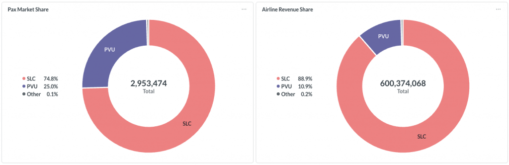
Provo Airport (PVU) is one such example. Located in Utah County, Utah, PVU operates in the shadow of nearby Salt Lake City International Airport (SLC). Utah County’s population grew from approximately 659,000 in 2020 to nearly 760,000 in 2025, an increase of 15.2%, while its median household income reached approximately $100,700. Despite this rapid growth and strong economic profile, much of the county’s air travel demand has historically been captured by SLC rather than PVU, as shown in Fig. 5. As Utah County continues to grow, these demographic and economic trends create significant opportunities for PVU to capture more local passengers through expanded nonstop service.
Migration Can Help Explain Changes in Destination Demand
Sometimes airports see a destination growing faster than expected but do not immediately know why. Migration may provide part of the explanation.
For example, if passenger demand to Nashville rises while the region is simultaneously receiving significant migration from Tennessee, the two trends may be related. Likewise, strong migration from South Florida may contribute to increasing travel between the regions. Migration data can therefore help explain changes that appear in O&D passenger trends. It should be viewed as supporting evidence rather than proof of causation.
Population Growth Can Also Change Airline Economics
Growing markets can affect route economics in several ways. More residents can contribute to:
- Higher base O&D demand
- Greater local passenger capture
- More premium demand
- More business activity
- Greater schedule depth
Over time, a market that could previously support three weekly flights may become capable of supporting daily service. A daily route may eventually support additional frequency. Population and migration trends can therefore help Air Service Development teams think beyond today’s demand toward the market’s future potential.
Growth Can Change Which Routes Matter Most
The destination mix of an airport does not necessarily remain constant as the population changes. New residents bring different:
- Family connections
- Business relationships
- Cultural connections
- Travel preferences
- Airline loyalty
A rapidly growing market may therefore require more than additional capacity on existing routes. It may gradually create demand for destinations that were historically less important. This is one reason migration-source analysis can be valuable for long-term network planning.
Migration Can Support Airline Business Cases
Migration data can add a forward-looking component to airline presentations. Instead of presenting only: Current population and Current O&D demand, an airport can also demonstrate:
- Population growth
- Net in-migration
- Major migration source markets
- Economic characteristics of incoming residents
- Existing air travel associated with those markets
For example:
“Our region has experienced sustained migration from the Northeast, while O&D demand to New York and Boston has also grown.”
That tells a more complete market story than population totals alone.
Use Migration Carefully
Migration is valuable, but it should not be interpreted as a direct passenger forecast. If 10,000 people move from one region to another, that does not mean they will generate a predictable number of airline trips back to their former home.
Travel behavior depends on many other factors, including:
- Income
- Family relationships
- Business connections
- Distance
- Airfare
- Available nonstop service
- Alternative transportation
Migration should therefore be used as a market indicator and explanatory variable, not as a substitute for observed passenger demand.
IRS Migration Data Also Has a Time Lag
Another consideration is timing. IRS migration statistics are based on tax-return address changes, which provide valuable broad coverage but are not a real-time measure of population movement.
Airport teams should therefore interpret migration data alongside more current indicators where appropriate. For strategic planning, however, the historical consistency and geographic detail of IRS migration data can make it particularly useful for identifying sustained migration relationships.
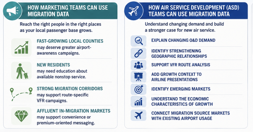
How Marketing Teams Can Use Migration Data
Airport Marketing teams can use migration trends to identify emerging geographic opportunities.
For example:
- Fast-growing local counties may deserve greater airport-awareness campaigns.
- New residents may need education about available nonstop service.
- Strong migration corridors may support route-specific VFR campaigns.
- Affluent in-migration markets may support convenience or premium-oriented messaging.
Marketing can therefore respond not only to where passengers are today, but also to where the local passenger base is growing.
How Air Service Development Teams Can Use Migration Data
For ASD teams, migration can help:
- Explain changing O&D demand
- Identify strengthening geographic relationships
- Support VFR route analysis
- Add growth context to airline presentations
- Identify emerging markets
- Understand the economic characteristics of population growth
- Connect migration source markets with existing airport usage
This can be particularly useful when a region is experiencing rapid demographic change.
Build a Migration-to-Air-Service Analysis
A practical analysis can follow this sequence:
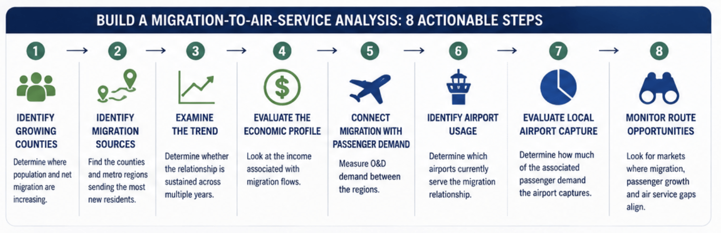
This converts population movement into actionable aviation intelligence.
How Fligence ZIP-OD Helps Airports Understand a Changing Market
FlightBI’s Fligence ZIP-OD includes a Migration Dashboard built around IRS migration data.
Airport teams can use the dashboard to examine county-level:
- In-migration
- Out-migration
- Net migration
- Migration trends
- Income associated with migration
and the relationships between migration source and destination markets.
Fligence then adds an aviation perspective by showing which airports are used between the migration source and target markets.
That connection is important. Traditional demographic data can tell an airport:
“People are moving here from this region.”
Fligence can help extend the analysis toward:
“People are moving here from this region—and here is how the associated air travel market is currently using airports.”
Combined with ZIP-level O&D, catchment, leakage, fare, and market-share analysis, migration becomes another way to understand how the airport’s passenger market may be evolving.
The Bottom Line
How does population growth and migration affect airport passenger demand? Population growth expands the potential passenger base. Migration provides additional insight into where that growth comes from and which geographic relationships may strengthen as a result.
People who move often retain family, social, business, and economic connections with their previous communities. Those connections can contribute to recurring air travel and help reshape destination demand over time.
For airport Air Service Development and Marketing teams, the strongest analysis combines:
population growth + migration trends + migration source markets + income movement + O&D demand + airport usage
rather than looking at population totals alone.
With the Fligence ZIP-OD Migration Dashboard, airports can use IRS migration data to understand how counties are gaining and losing residents, where those people are moving from or to, and which airports are being used between the migration source and target markets.
The strategic question is not simply:
“Is our population growing?”
It is:
“Who is moving into our market, where are they coming from, and how could those changing connections reshape future air travel demand?”